Joyful illustrated packaging

Developing food for pets that only contains natural ingredients can be a tough job nowadays. However, coming up with the right packaging for it can get as tough.
Define
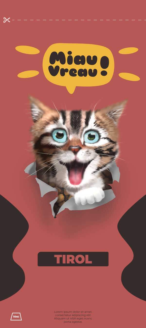
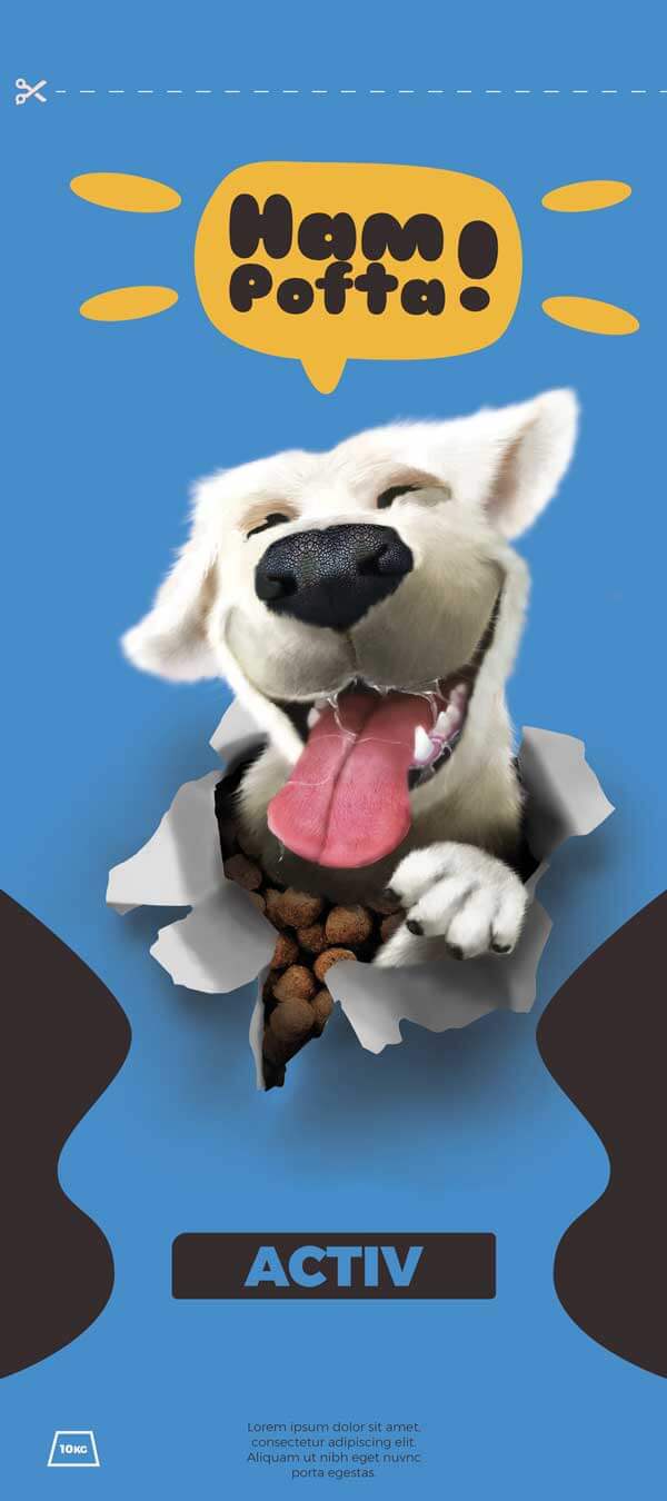
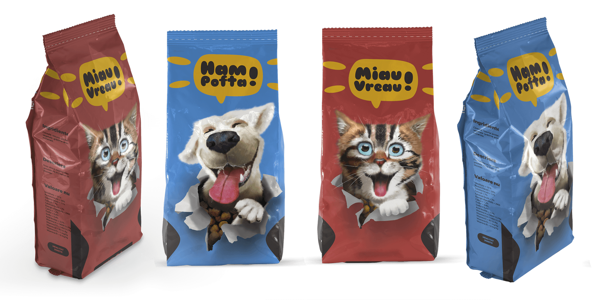
The brief required packaging design for a range of bio pet food that would position them as premium on the market. And while “premium” is usually represented by dark colours, elegant shapes and minimalist designs, we wanted to both challenge ourselves and the market by coming up with illustrations and colourful elements.

Develop
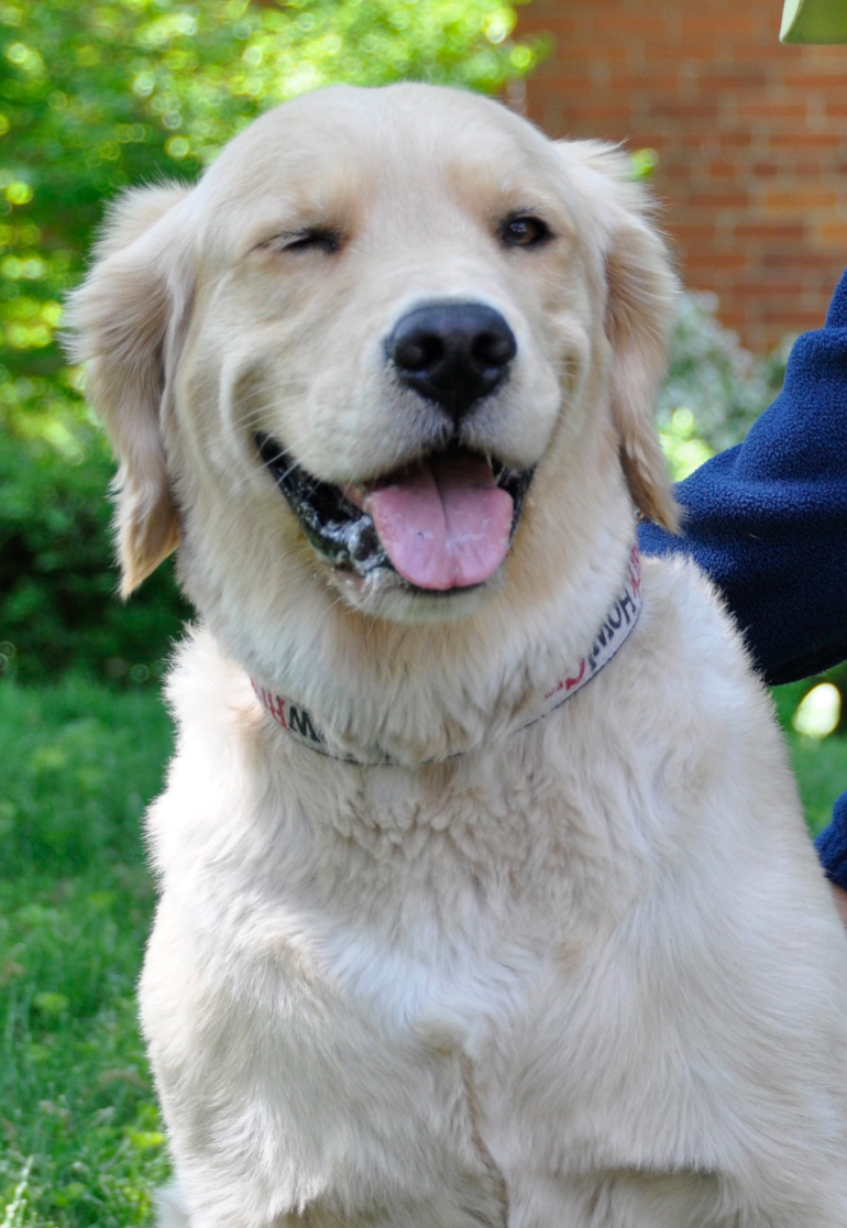
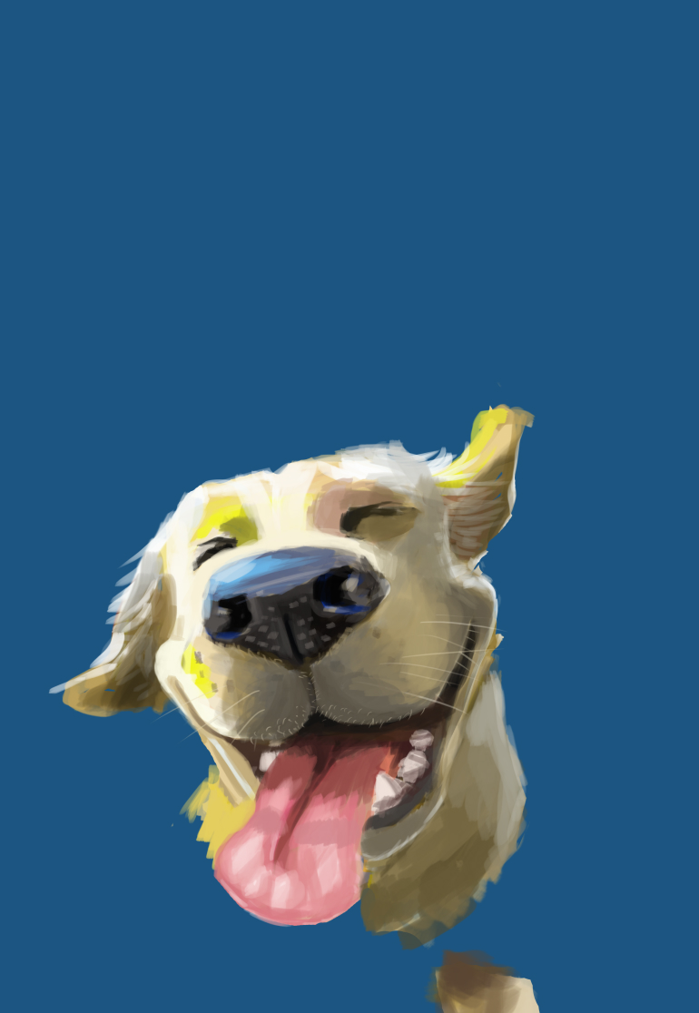
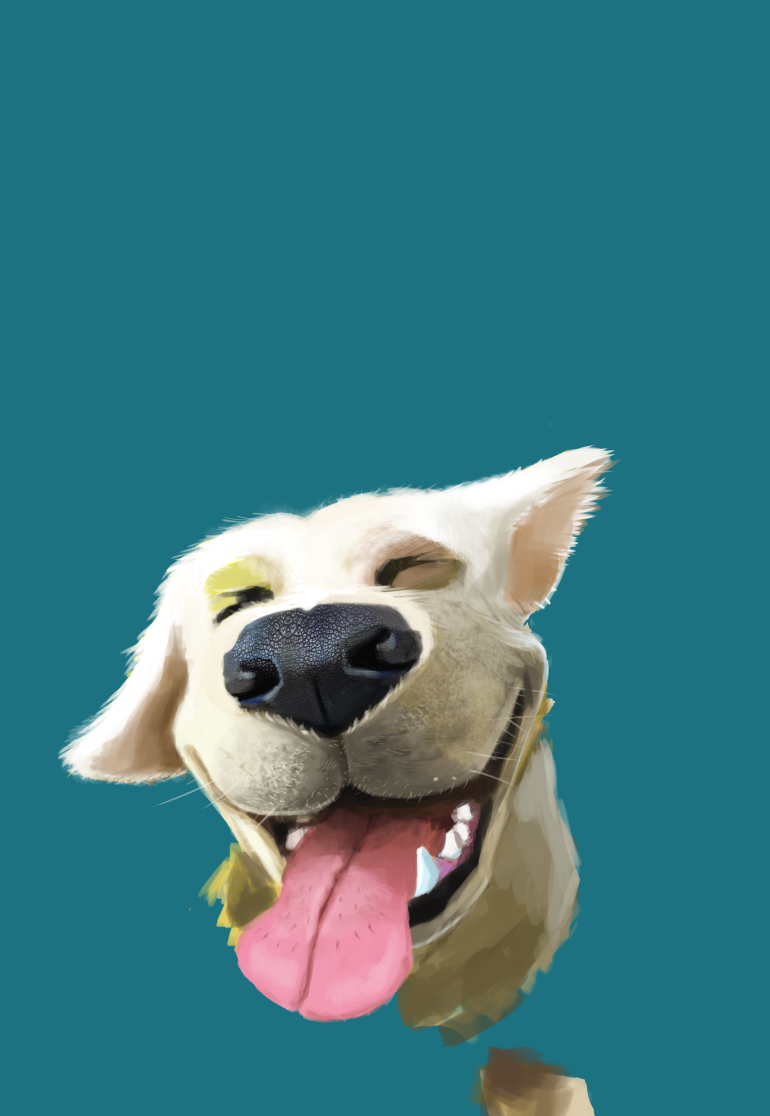
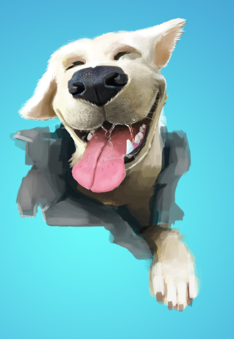
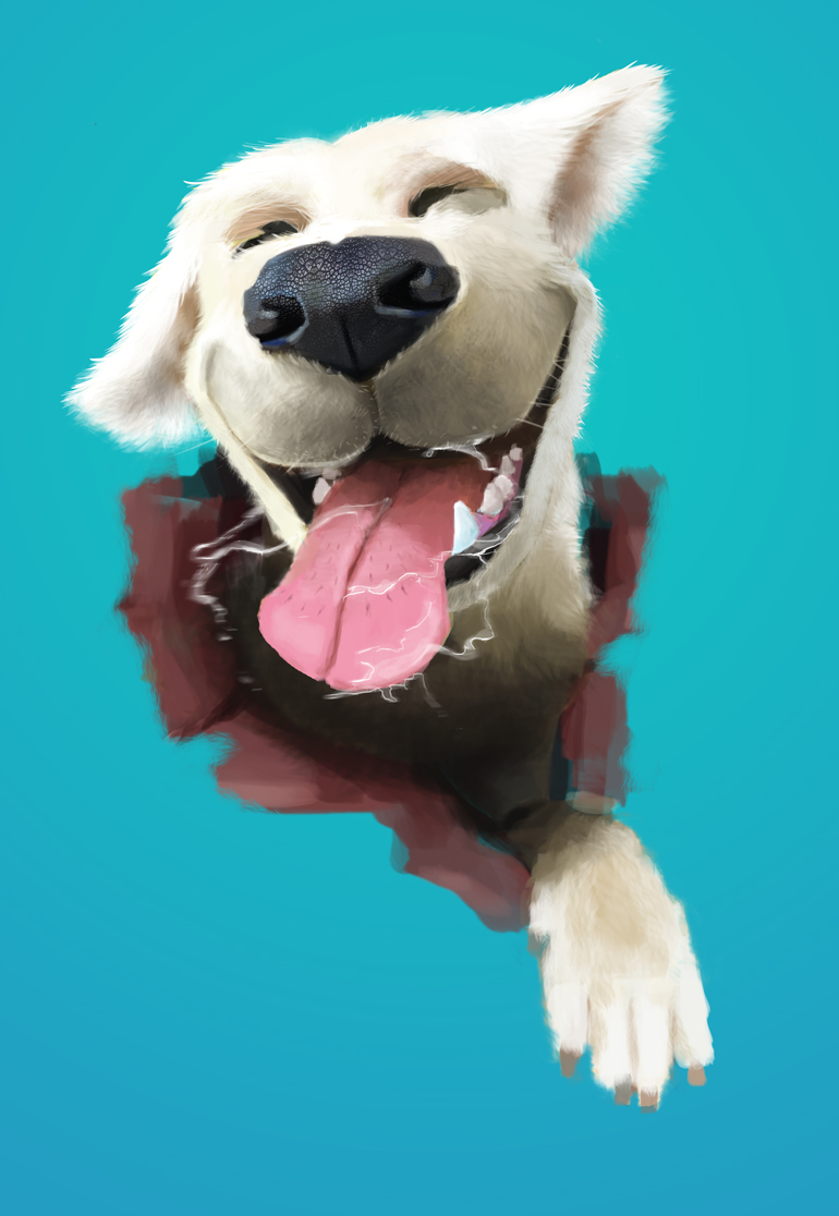
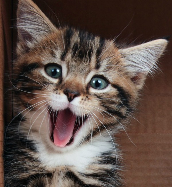
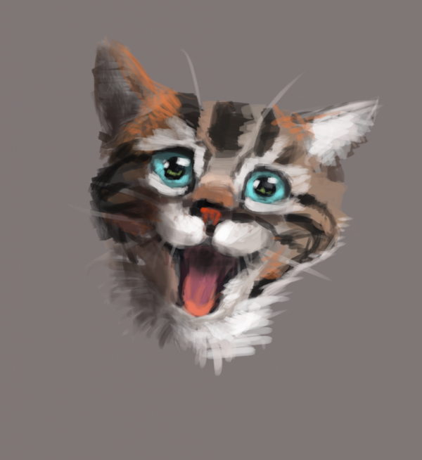
We wanted to outdo ourselves for this project, therefore we wanted the illustrations to be special. For the cat food packaging, for instance, we took the photos of five different species of cats and mashed them up. On the other hand, for the dog, we wanted it to be illustrated as realistically as possible, so that the dog looks like it’s looking forward to eating the food.
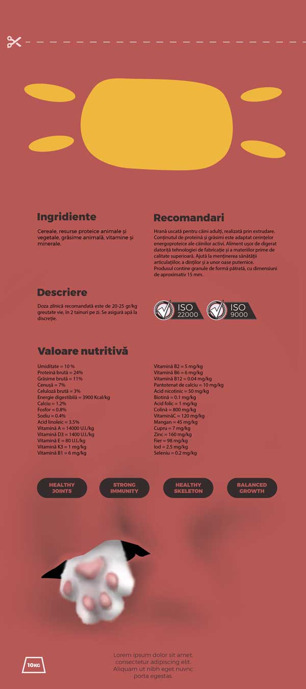
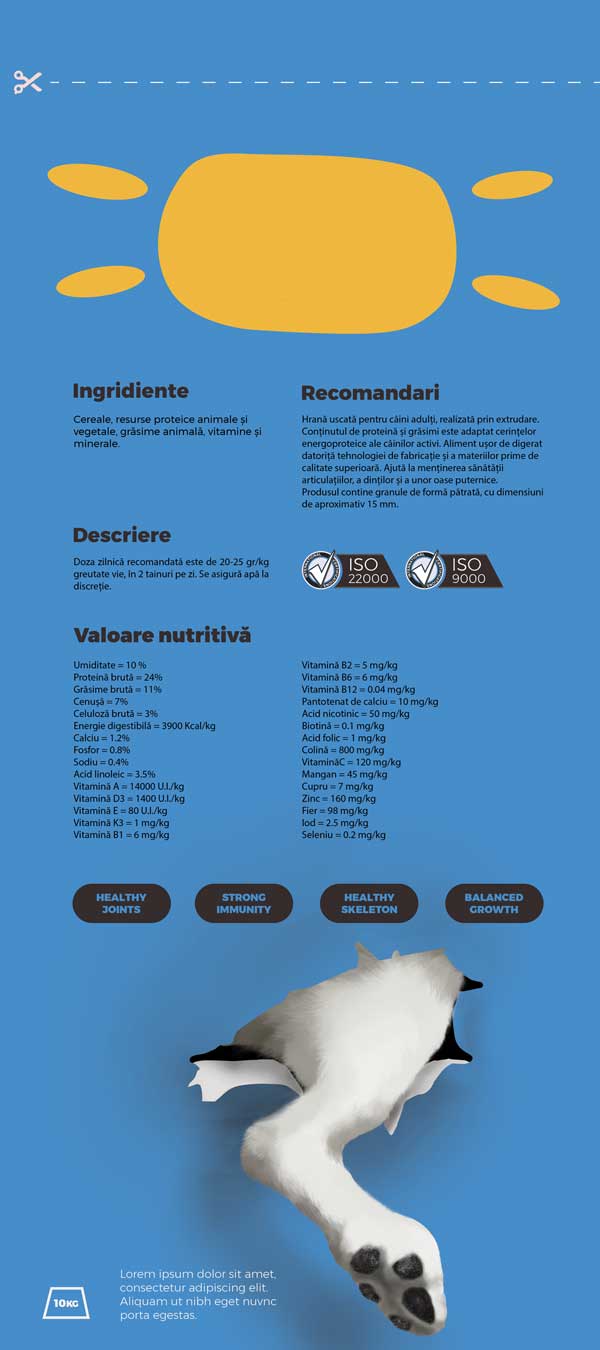
Usually, designers pay attention to the front face of the package and ignore the back. However, we wanted to catch the attention from all sides. Therefore, we designed around the idea of the pet being inside the bag – ‘cause that’s how delicious the food is!

Deliver
The result is meant to spark joy: it stands out, it is unique and joyful and it’s courageous when all the other bio and premium products shy away from illustration and too much colour.
