Turbomecanica’s airy brochure
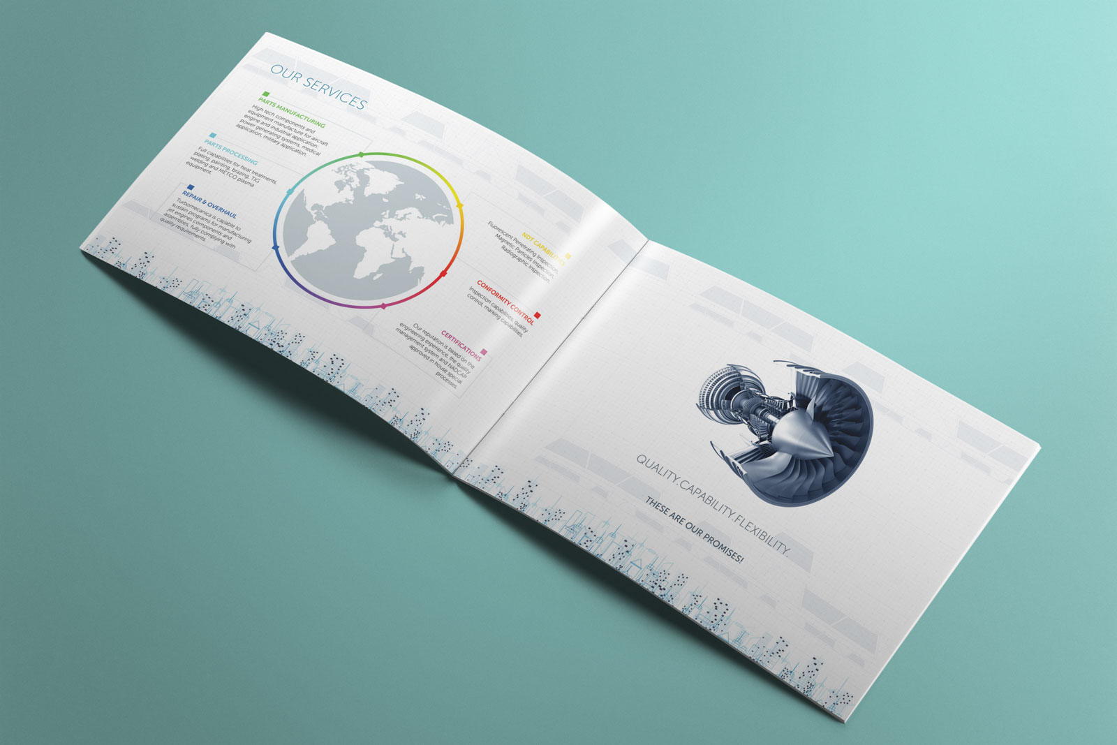
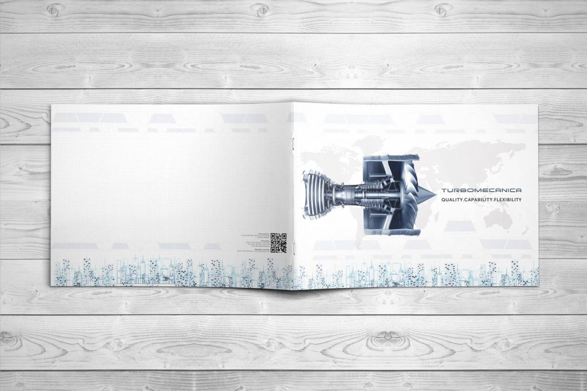
The ideal balance between aesthetics and descriptive is always a problematic issue. Especially when you’re in charge of designing a brochure for a very technical domain such as aeronautical engineering.
Define
A brochure has two essential elements that have to be taken into account from the very beginning: the layout and the text.
That’s why the first thing we agreed upon during the brainstorming was that the layout would be airy. Pun intended.
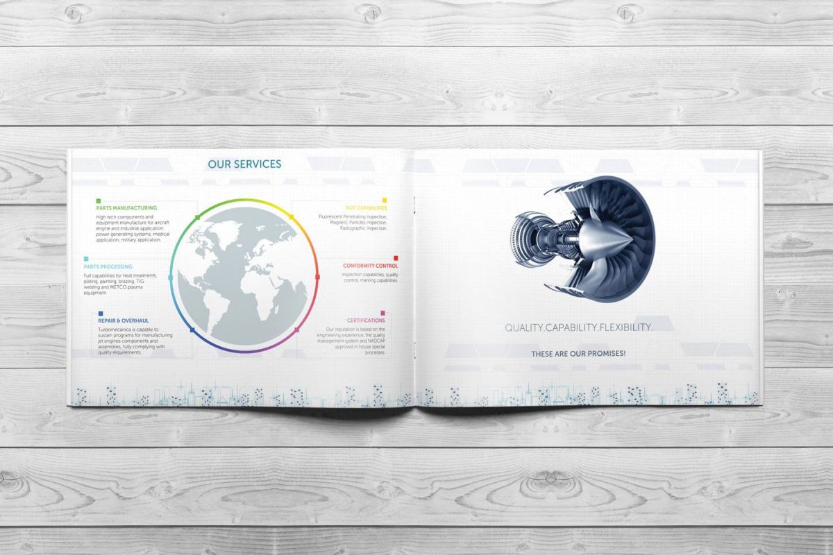
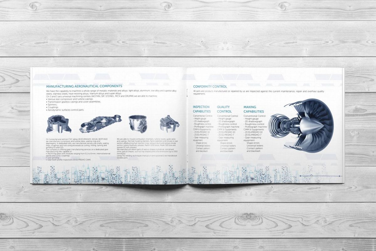
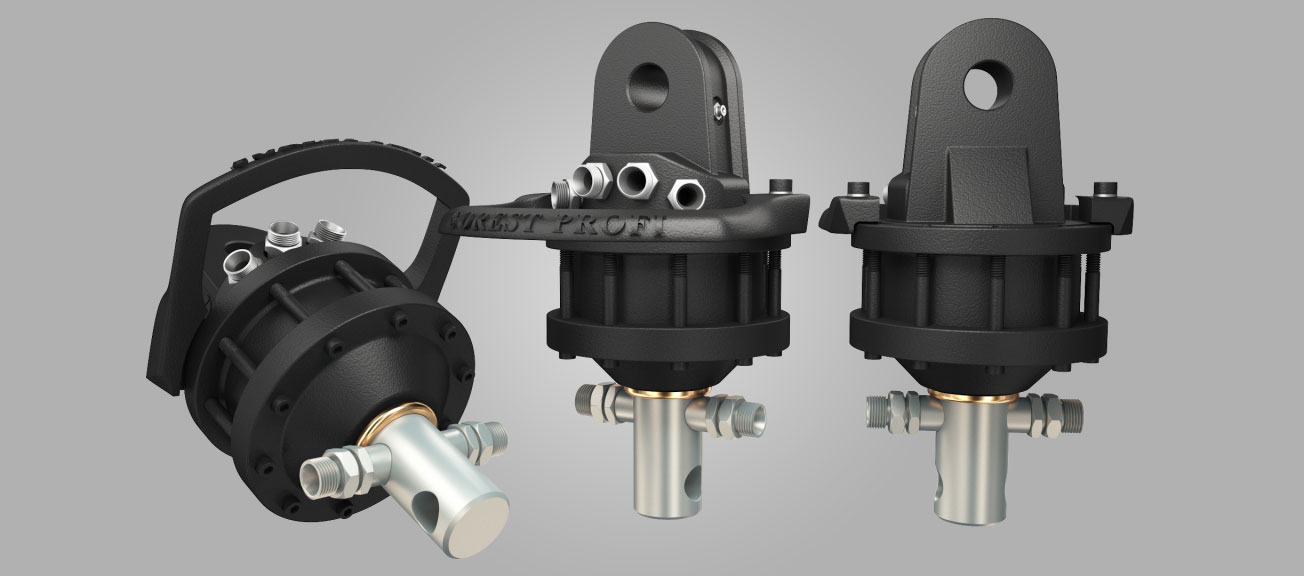
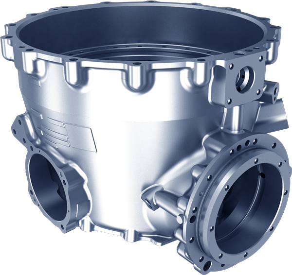
Then, we wanted to make everything a little more appealing by inserting 3D models.
Develop
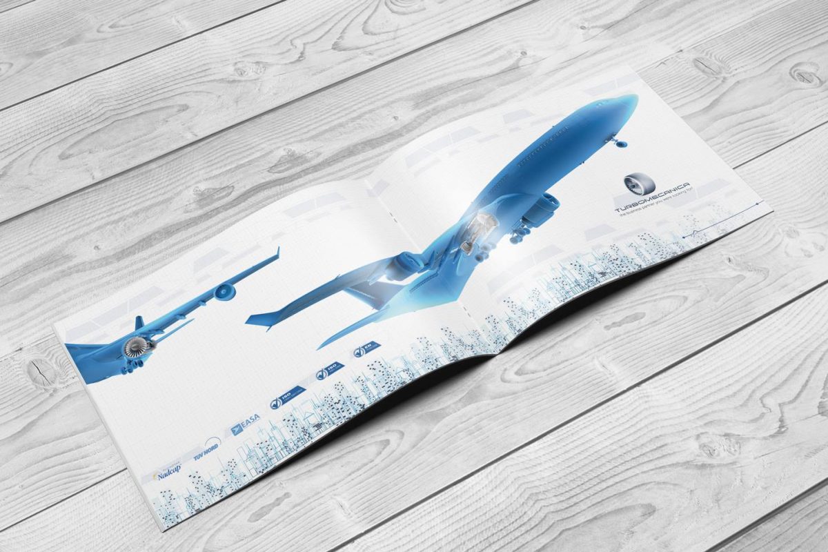
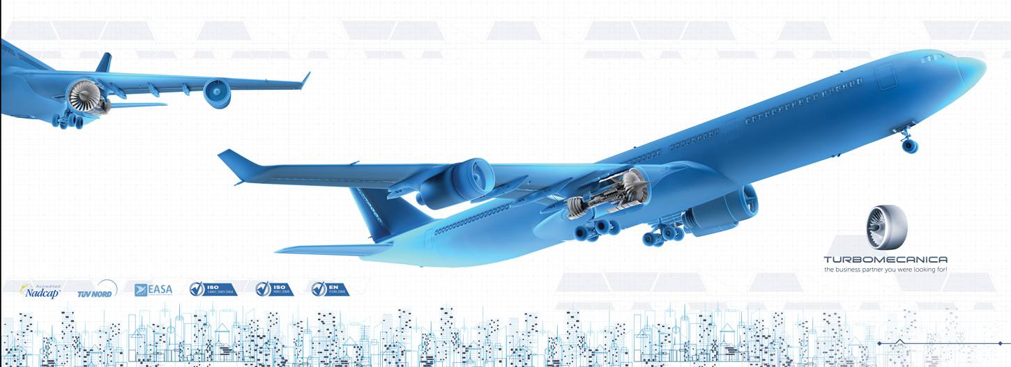
We started by making 3D models for each piece that Turbomecanica wanted to place in the brochure. Then, we modeled and rendered other images needed for the layout design such as a plane, a helicopter, a turbine and then placed everything in a clean layout.
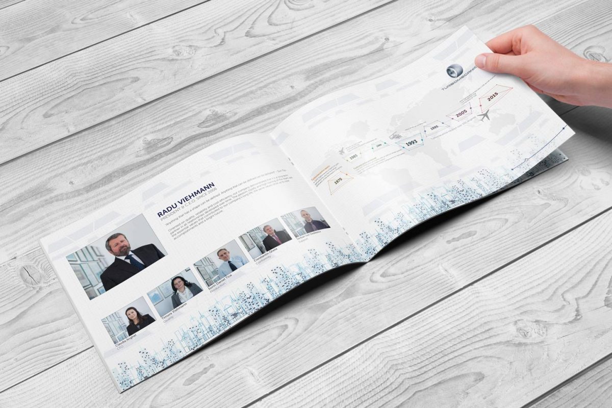
As for the text, we carefully selected the information that was really important for any reader, so that he would be given crystal-clear explanations, while we also used symbols to express some small parts of the text, so that the entire material would be easy and fast to go through.
Deliver
We succeeded to deliver an informative but visually engaging brochure, that fits perfectly in the engineering landscape, but is also easy to understand and read for anyone interested.
