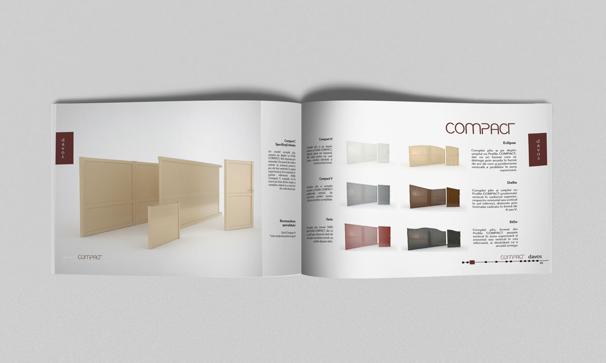
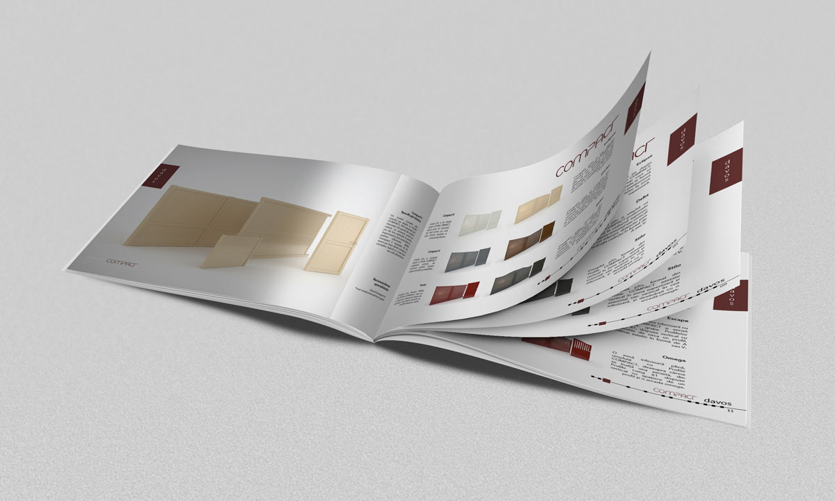
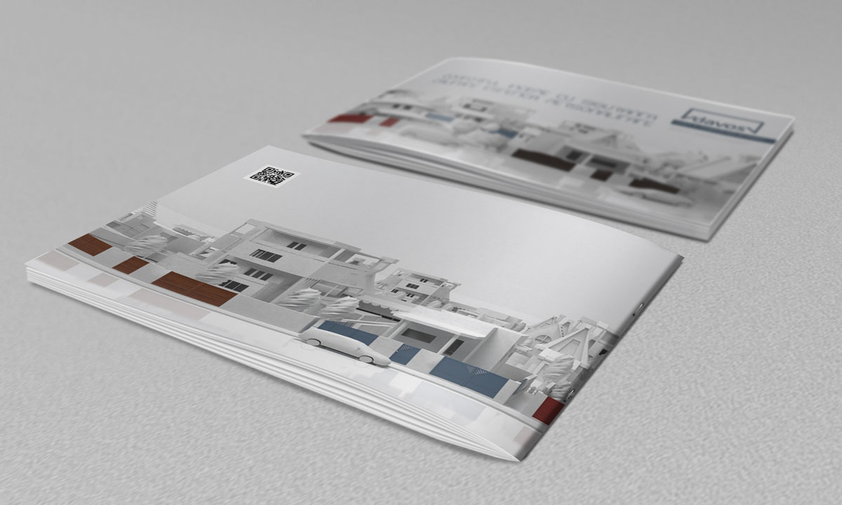
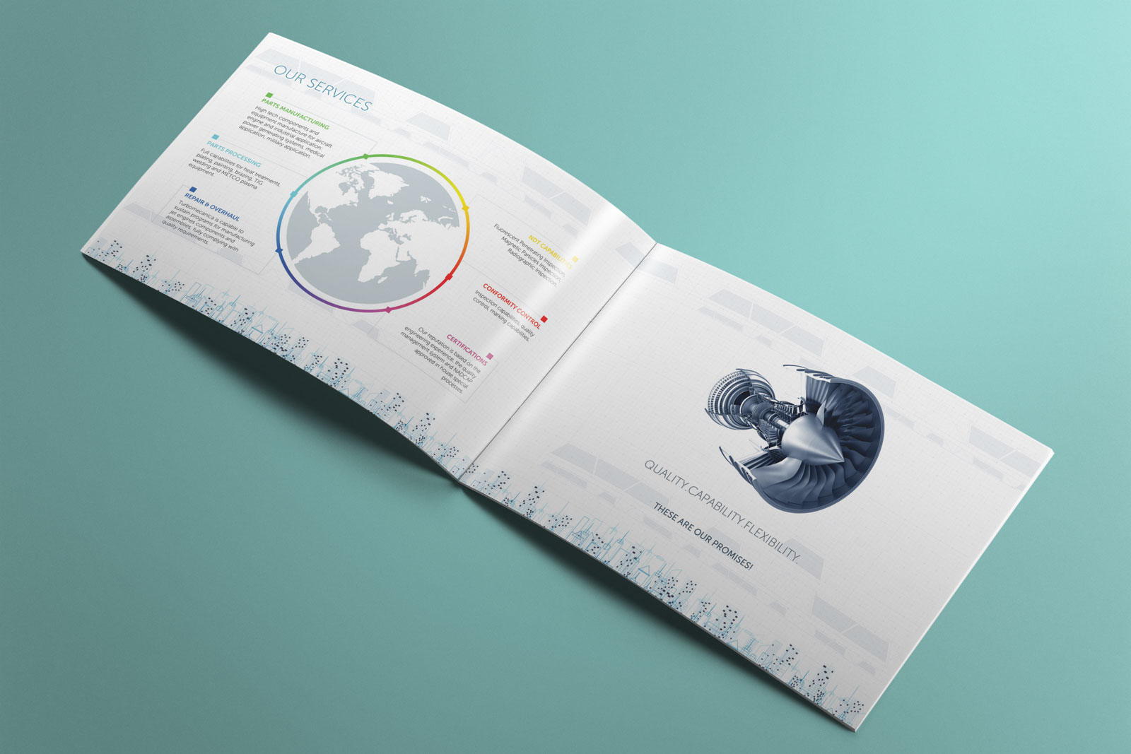
The catalogue that doesn’t fence the creativity
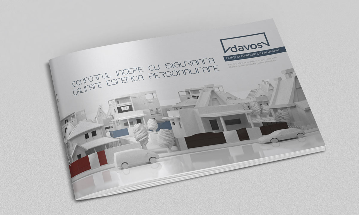
It’s pretty unlikely that you’ll get carried away while looking at aluminium gates and fences. In this case, how can you present them so that you catch the customers’ attention?
Define
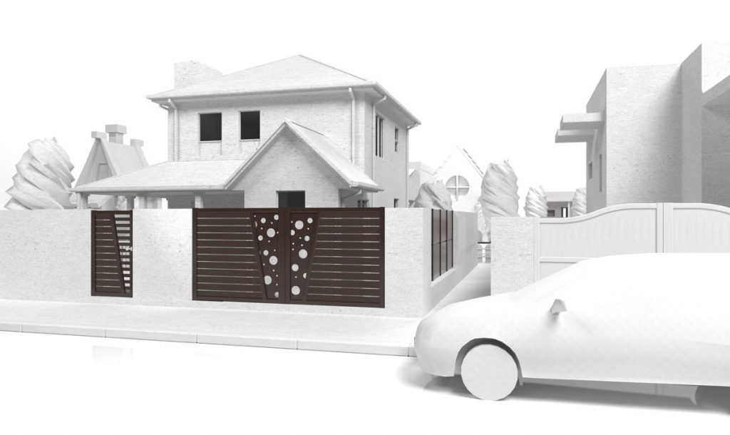
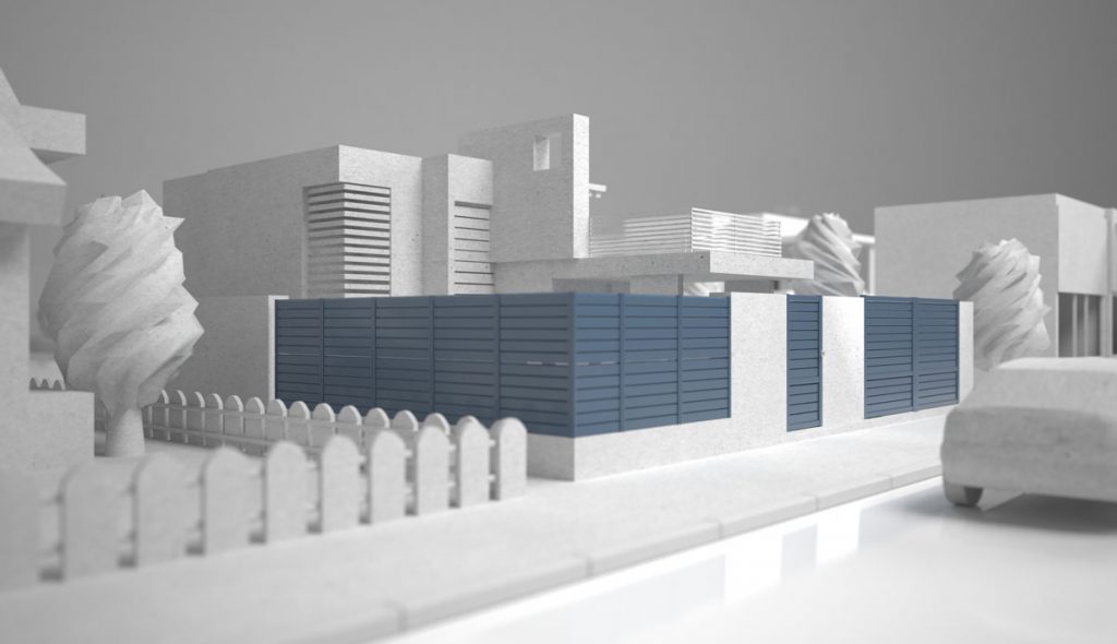
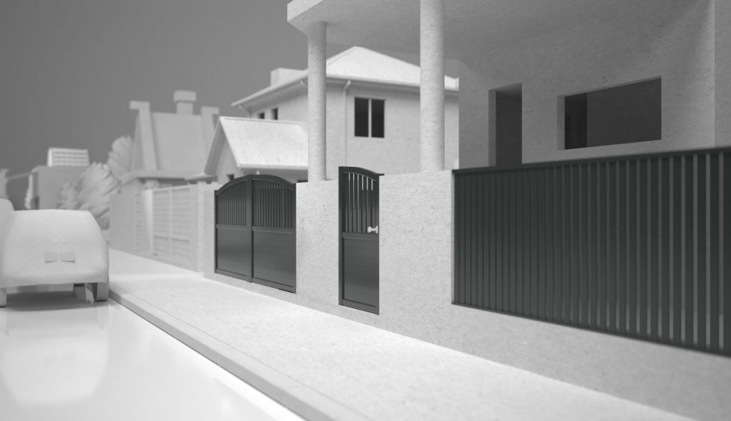
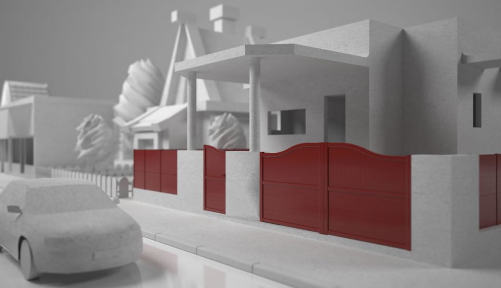
The request was for us to make a catalogue that contained all the different types of gates, fences and accesories that our client, Davos, had to offer. The challenge, however, was to find a way to make them stand out and to make people want to read more about them.
Therefore, we thought about something we’re really good at: 3D modeling.

Develop
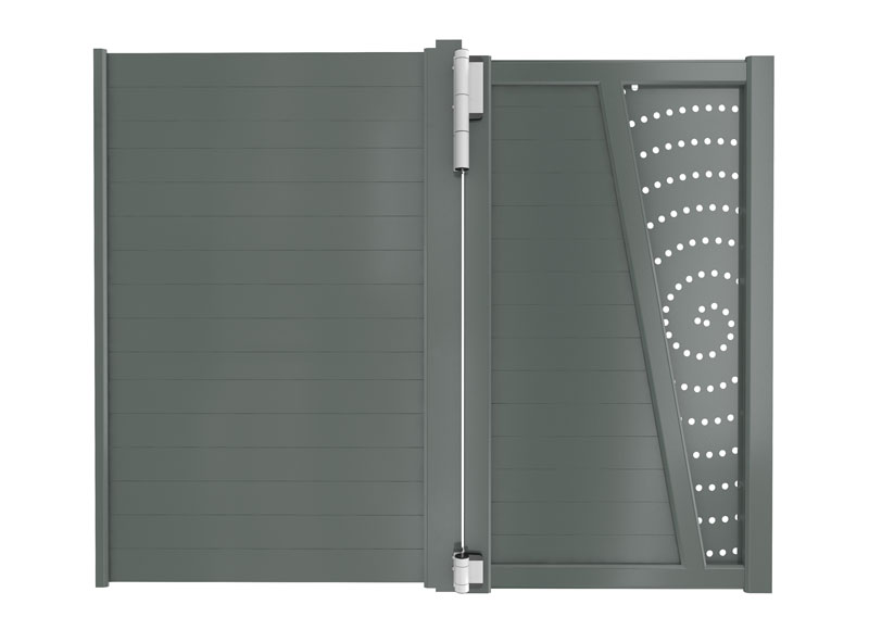
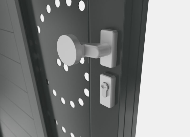
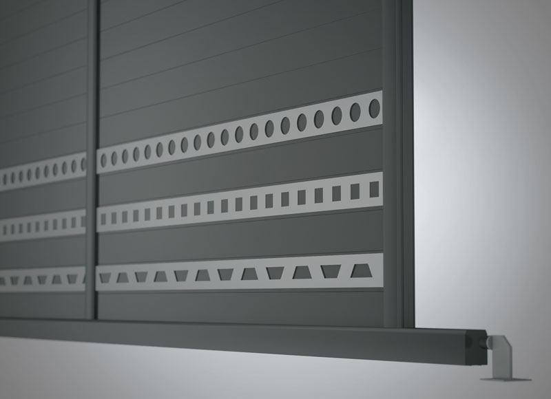
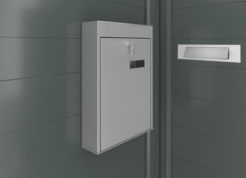
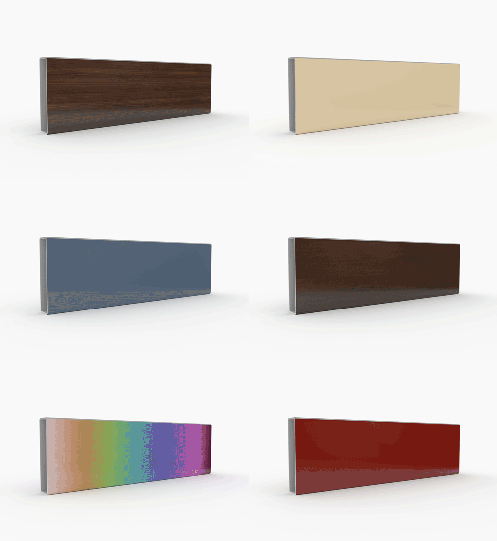
While working on this catalogue, we made sure to use friendly fonts, just enough white space and, most importantly, the products we modeled.
The images needed to highlight function, to emphasize the advantages, to show the variety and their uniqueness, to make the potential customer see beyond the cold metallic luster and appreciate the aesthetics. In the end, the layout was designed, the text refined and the images put in their place.
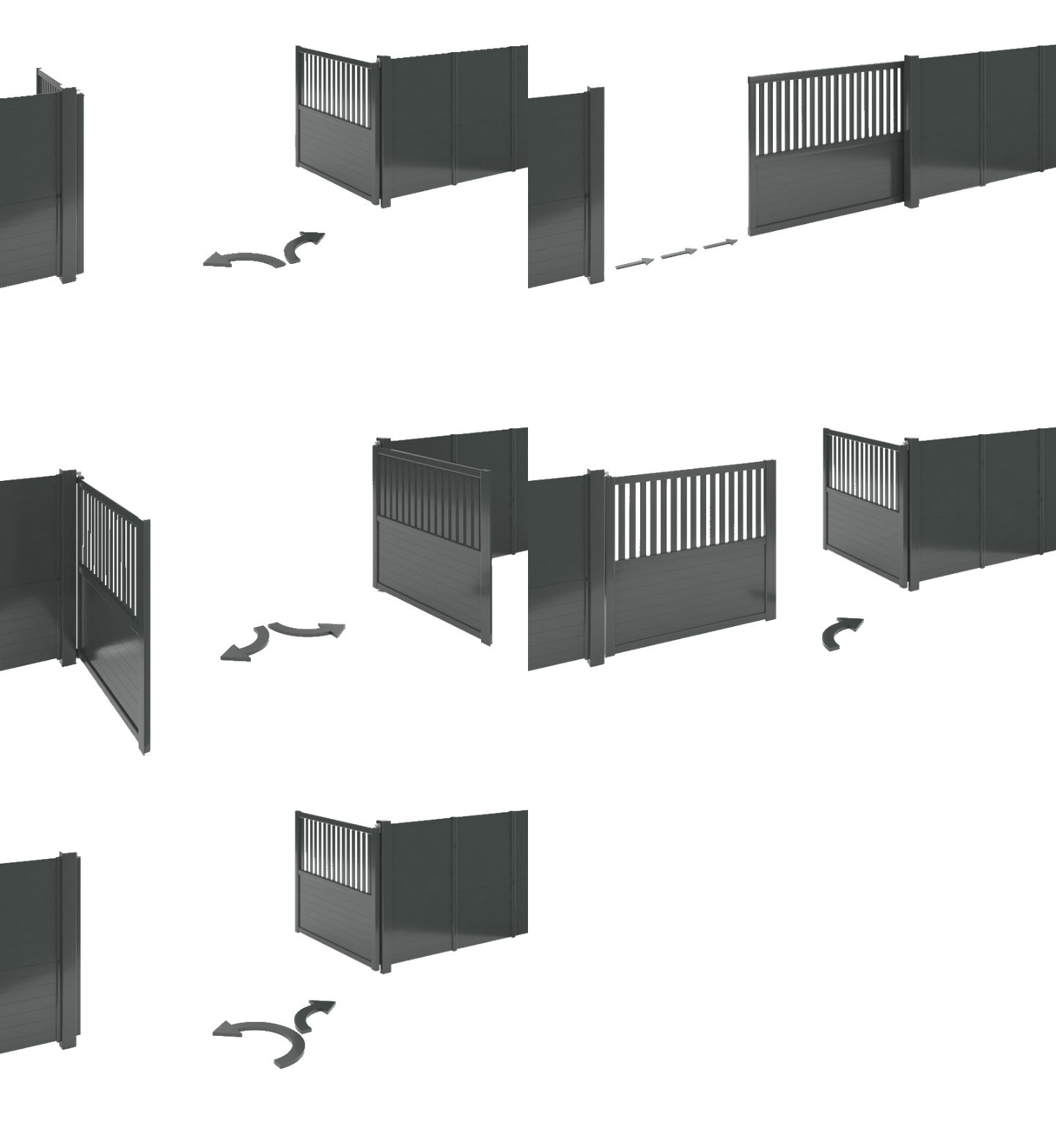
Deliver
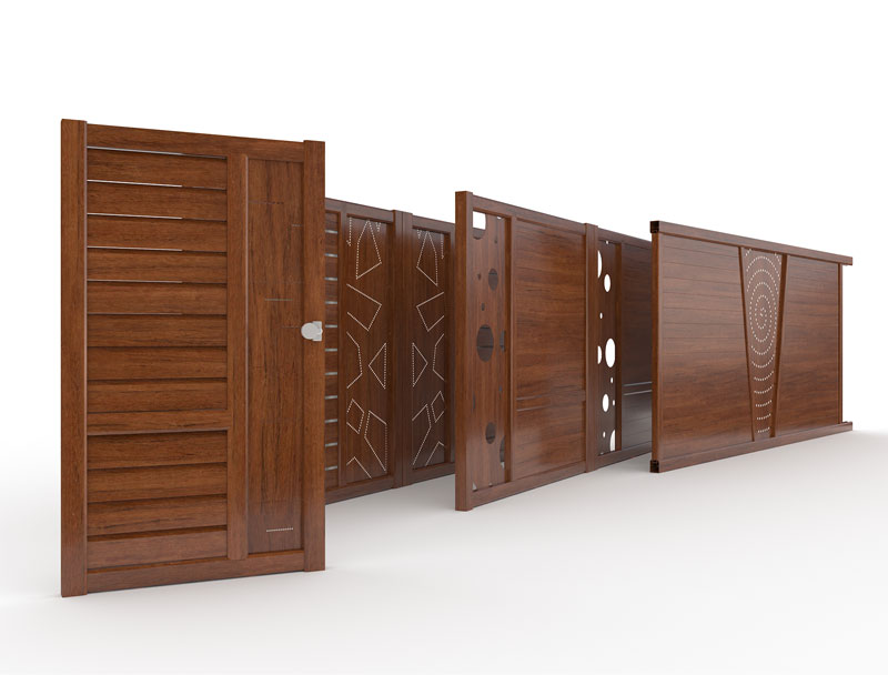
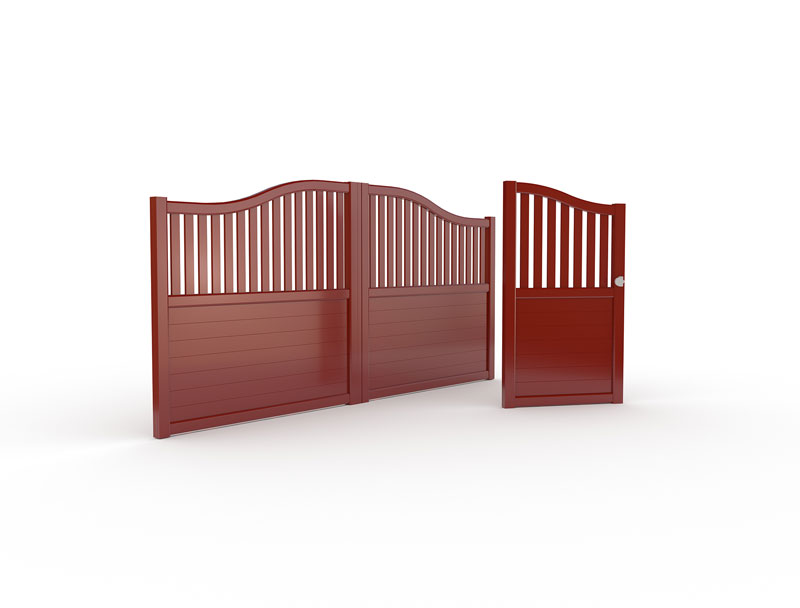
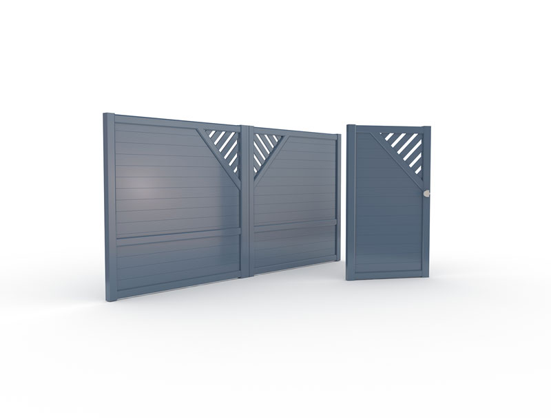
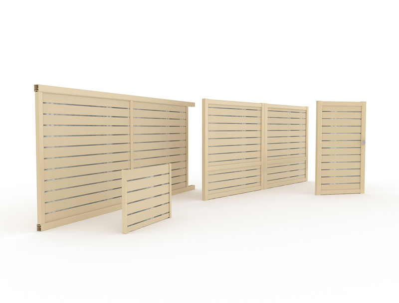
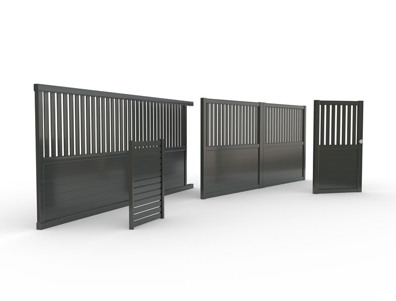
Thus, we delivered a friendly catalogue in spite of a less friendly category of products. However, we succeeded to put them in another light and to shift from the functional nature of the products to the aesthetic one.
